The Ultimate Guide to Lighting Color Temperature (CCT)
Discover the ultimate guide to lighting color temperature! Learn how it shapes your space, affects your mood and work efficiency!
A quick overview of the topics covered in this article.
What is Color Temperature? & What is CCT in lighting?
Color temperature, simply put, is a way to describe the color of light. Imagine sometimes you see light that is warm yellow, like a sunset or an incandescent bulb, while other light is cool white, like noon sunlight or some fluorescent lamps. Color temperature is used to represent these different colors of light.
CCT stands for Correlated Color Temperature. In strict terms, color temperature is a very precise concept and represents an ideal standard, while CCT is more of an approximation. Sometimes, the color of a light source does not exactly match the color of light at a specific black body temperature but is quite close. In such cases, we find the black body temperature that most closely resembles the light source’s color and use that temperature as the correlated color temperature of the light source. It’s like having a standard color template; color temperature is like an exact scale on the template, while correlated color temperature is the closest scale we use when we can’t find a perfect match.
Therefore, CCT and color temperature can be considered nearly the same, and in the lighting industry, CCT and color temperature are often used interchangeably.

The above figure well shows the difference between the ideal color temperature and CCT. The red curve represents the color temperature, which is the precise value calculated under the ideal model. Each quadrilateral around the curve represents the approximate range of a certain color temperature, which we define as CCT. In lighting design, CCT is often used to represent the color of the light.
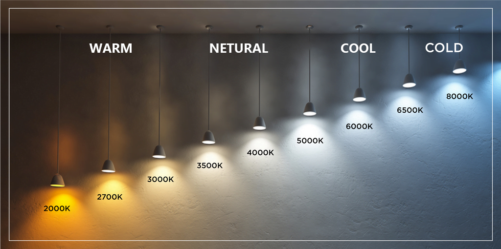
The unit of color temperature is “Kelvin” (K). The lower the value, the warmer the light appears; the higher the value, the cooler the light appears. Here are some examples:
– Candlelight: about 1800K, very warm, somewhat orange-yellow.
– Incandescent bulbs: about 2700K to 3000K, appearing warm white.
– Sunrise or sunset sunlight: about 3000K to 4000K, warm yellow.
– Noon sunlight: about 5000K to 6000K, appearing neutral white.
– Overcast daylight: about 6500K to 7500K, appearing cool white or even a bit blue.
Common Color Temperature Ranges for Lighting Fixtures
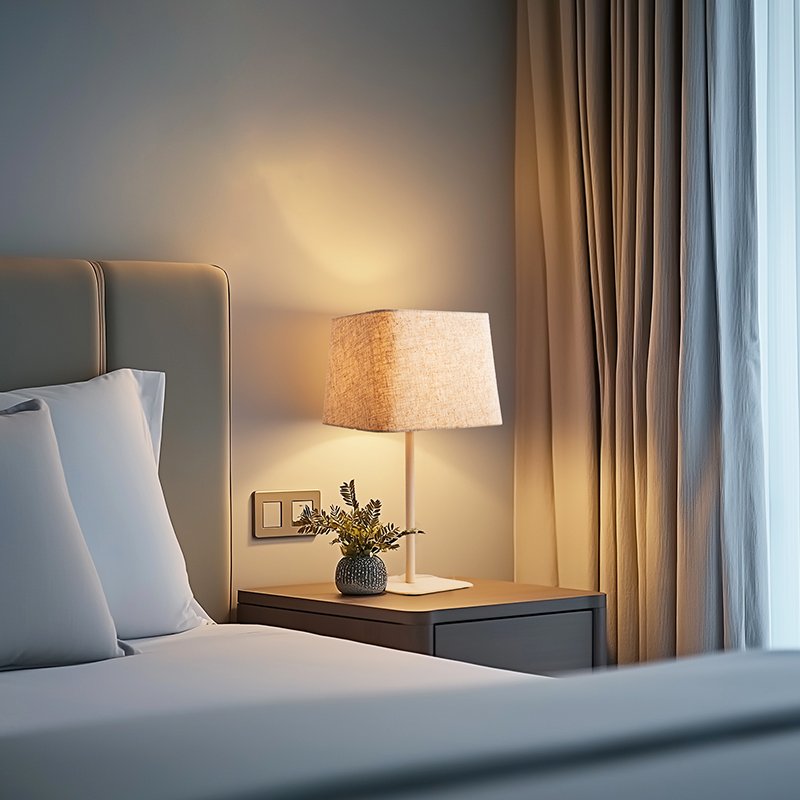
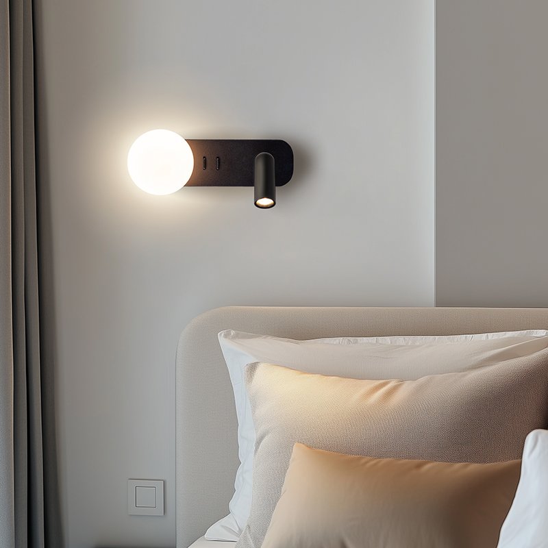
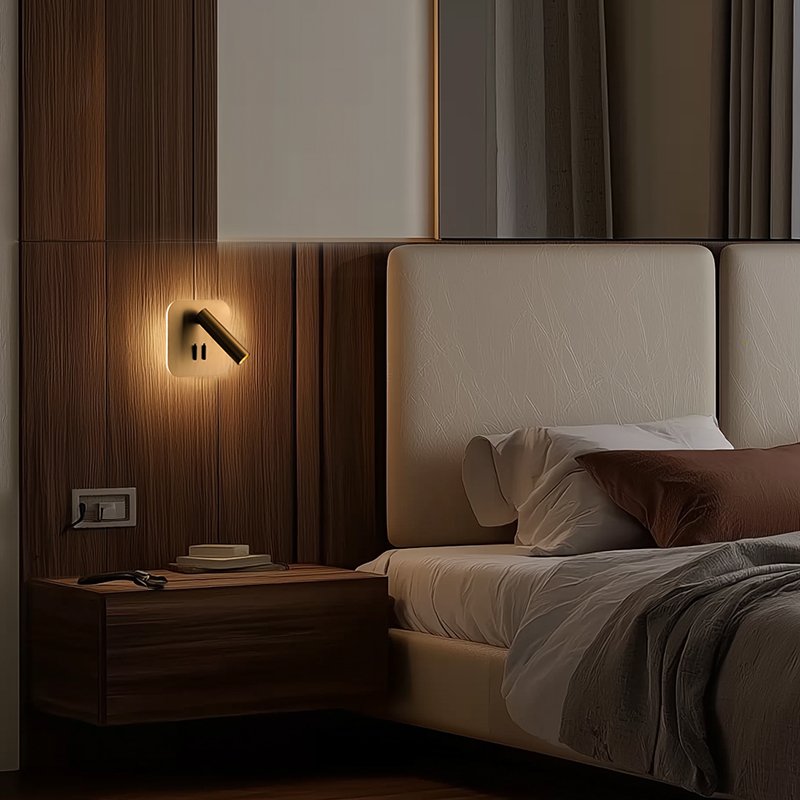
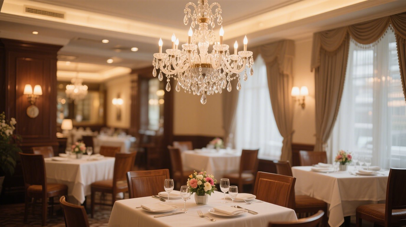
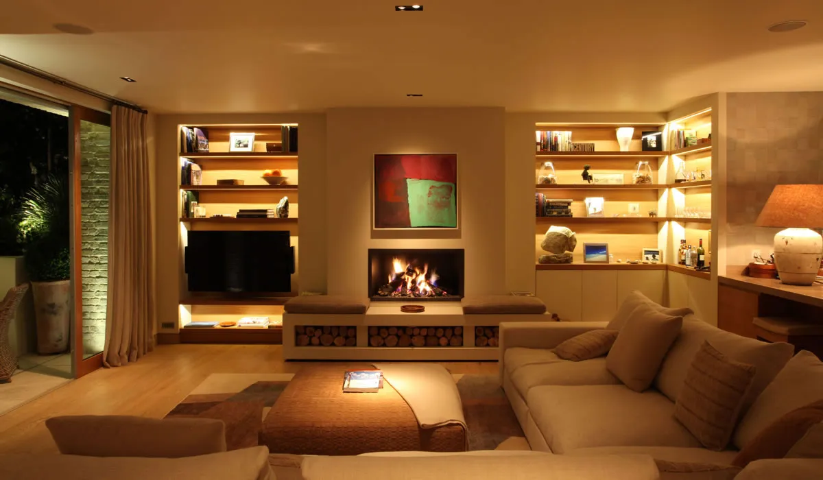
Warm White : 2700K – 3500K, gives a warm, cozy feeling, similar to traditional incandescent lighting, suitable for spaces like bedrooms and living rooms to create a relaxing atmosphere.
Natural White : 4000K – 5000K, close to natural light, visually clear and natural, suitable for study rooms and kitchens where higher illumination clarity is required.
Cool White : 5500K – 6500K, cool and bright, often used in offices and shopping malls where high concentration and efficiency are required.
Cold White: >6500K, very cold and stern light, looking bluer. It is usually used in industrial or special lighting places.
Why is Color Temperature Important in Lighting Design?
Color temperature is crucial in design because it affects how we perceive colors and the mood and atmosphere of a space or scene. It influences the aesthetic effects of a space and is directly related to the user’s visual comfort, mood, work efficiency, and health. The proper selection and use of color temperature can create an ideal lighting environment, enhancing the functionality and user experience of the space.
- Shaping the Atmosphere: Different color temperatures can give spaces unique characteristics. Low color temperatures (like 2700K – 3000K) create a warm, cozy, and intimate atmosphere, suitable for bedrooms and dining rooms where relaxation is desired. High color temperatures (like 5000K – 6500K) bring a refreshing, bright, and energetic feeling, suitable for offices and shopping malls where alertness and activity are required.
- Highlighting Design Elements: Lighting designers can use color temperature differences to highlight key elements in the design. For example, in an exhibition space, higher color temperature lighting can focus on important exhibits, making them stand out against the surrounding lower color temperature environment.
- Influencing Color Presentation: Color temperature affects how colors are presented. Warm color temperatures might make some colors look richer and deeper, while cool color temperatures can make colors appear more vivid and clear. For instance, in a blue-themed interior space, choosing high color temperature lighting can make the blue appear more vibrant and lively.
- Enhancing Visual Layers: Using different color temperature lighting for zoned lighting can create rich visual layers within the same space. For example, in a living room, using low color temperature floor lamps to illuminate a relaxation corner while using higher color temperature chandeliers for the main activity area can delineate different functional zones.
- Meeting Functional Needs: Choose the color temperature according to different functional needs. For example, hospital operating rooms require high color temperature lighting to ensure clear vision, while children’s rooms might benefit from low color temperature lighting to create a warm and safe feeling for the children.
How is Color Temperature Defined Around the World?
The definition and understanding of color temperature worldwide are based on the same physical concept, the black body radiation theory. However, different regions and industries might have varying standards and applications.
International Standards
The International Commission on Illumination (CIE) is the main international organization defining color temperature standards. The standard color temperature ranges defined by the CIE are as follows:
– Warm white: 2700K – 3000K
– Neutral white: 3000K – 5000K
– Cool white: 5000K – 6500K
The International Electrotechnical Commission (IEC) specifies four standard illuminants with color temperature standards:
– Standard Illuminant A: Represents the light from a full radiator at 2856K.
– Standard Illuminant B: Represents direct sunlight with a correlated color temperature of approximately 4874K.
– Standard Illuminant C: Represents average daylight with a correlated color temperature of about 6774K.
– Standard Illuminant D65: Represents daylight with a correlated color temperature of about 6504K.
– Standard Illuminant D: Represents other daylight illuminants aside from D65.
United States
The American National Standards Institute (ANSI) and the Illuminating Engineering Society (IES) define the color temperature standards, commonly used in lighting design and specifications:
– Warm white: 2600K – 3700K
– Neutral white: 3700K – 5000K
– Cool white: 5000K – 6300K
Europe
The European Committee for Standardization (CEN) recommends color temperature ranges, which might slightly differ by country or region:
– Warm white: 2700K – 3000K
– Neutral white: 3000K – 4000K
– Cool white: 4000K – 6500K
China (GB)
The Chinese National Standard GB 50034 – 2013 “Architectural Lighting Design Standard” specifies suitable color temperatures for different indoor lighting scenarios:
– Rooms or areas for long-term work or stay: 3300 – 5300K
– High illumination areas: 5500 – 6500K
– Areas requiring special color rendering: 4500 – 5300K
How to Measure Color Temperature?
Color temperature is determined by comparing the color of a light source to the light emitted by a black body at a specific temperature. Specifically, color temperature refers to the color of light emitted by a black body at that temperature. Various devices, such as colorimeters or spectrophotometers, can measure color temperature. These devices detect specific wavelengths of light emitted by a light source and analyze the wavelengths to calculate the color temperature in Kelvins.
Now there are some specialized mobile phone applications that can measure color temperature through the mobile phone camera. But it should be noted that its measurement accuracy may not be as good as professional instruments.
How Does Color Temperature Affect Our Mood and Work Efficiency?
- 2700K – 3000K: Creates a warm, comfortable, and relaxing atmosphere. It can reduce stress and anxiety, making people feel more peaceful and stable. This type of lighting is usually used in residential environments like bedrooms and living rooms but can cause drowsiness if used in work environments.
- 4000K – 5000K: Often used in study and office environments, this lighting can enhance alertness and cognitive activity, improving work and study efficiency. However, if too bright, it can cause eye fatigue.
- 5000K – 6500K: Provides a cool, bright feeling that makes people feel energized, typically used in industrial and outdoor environments. It helps increase attention and productivity, but long-term exposure may cause tension and anxiety.
Benefits of Using Warm Lighting at Home
Using warm lighting at home has numerous benefits:
- Creates a Cozy and Comfortable Atmosphere: Warm lighting can help create a warm, comfortable, and relaxing atmosphere, conducive to rest and relaxation. It can reduce stress and help people feel more at ease.
- Enhances Sleep Quality: Studies have shown that warm lighting is more conducive to sleep and relaxation than cool lighting. Exposure to warm lighting before bedtime can promote the production of melatonin, a hormone that helps regulate sleep.
- Improves Family Interaction: Warm lighting can create a cozy environment, enhancing family interaction and communication. It can help family members feel more intimate and connected.
- Reduces Eye Strain: Warm lighting is generally softer and less glaring, reducing eye strain and fatigue. It is especially beneficial for children and the elderly, who are more sensitive to light.
- Enhances Home Decor: Warm lighting can highlight the colors and textures of home décor, making the space appear more inviting and aesthetically pleasing.
By using warm lighting at home, you can enjoy a more comfortable and pleasant living environment, enhancing your quality of life and family happiness.
Cool Lighting vs. Warm Lighting: Which is Better for Your Health?
Warm lighting typically offers the following health benefits:
– Promotes Sleep: Warm light helps stimulate the secretion of melatonin, making it easier to feel sleepy and improving sleep quality. For example, using warm lighting in the bedroom can help the body relax faster before sleep, making it easier to fall asleep.
– Reduces Eye Strain: Warm light is relatively soft and less stimulating to the eyes, especially at night or in low-light environments.
Some advantages of cool lighting include:
– Enhances Alertness: Cool light can make people feel more alert and improve work and study efficiency in environments requiring high concentration and wakefulness, such as offices and study areas.
– Clearer Vision: Cool light provides brighter and clearer illumination, which may be beneficial for tasks requiring detailed vision.
However, using inappropriate lighting at the wrong time can have adverse effects. For instance, prolonged exposure to cool light before bedtime may disrupt sleep, while using warm light when needing to concentrate may cause drowsiness and lack of focus.
There is no absolute answer as to whether cool or warm light is better for health. It is important to choose the appropriate lighting color temperatures based on different times, activities, and environments. For example, exposure to cool light during daytime activities and more warm light in the evening.
Color Temperature and Energy Consumption & Lumens
Color temperature has a certain relationship with energy consumption and lumens, but it is not a direct and simple correlation.
Firstly, energy consumption mainly depends on the type, technology, and power of the fixture. Generally, fixtures of the same type and power consume roughly the same amount of energy, regardless of the color temperature. However, different types of fixtures may have different energy efficiencies when producing the same lumen output at different color temperatures. For instance, LED fixtures might have higher energy efficiency when producing high color temperature light compared to low color temperature light.
Main Advantages and Disadvantages of Different Color Temperatures
| Color Temperature | Advantages | Disadvantages |
|---|---|---|
| Warm White (2700K-3000K) | – Creates a warm, cozy atmosphere, making people feel relaxed and comfortable. – Helps reduce eye strain, especially in night-time use. – Enhances the sense of intimacy in a space, suitable for bedrooms and living rooms. | – The lighting brightness may be relatively low, not suitable for tasks requiring high concentration or fine operation, such as reading detailed documents or crafting. – May cause drowsiness, not suitable for environments requiring alertness. |
| Netural White (4000K-5000K) | – Provides more natural light, similar to daytime natural light. – Suitable for most indoor activities, such as daily living, general reading, and writing. – Maintains a certain clarity without being too glaring. | – Less warm compared to low color temperature. – May not be warm enough for specific scenarios where a romantic or particularly cozy atmosphere is desired. |
| Cool White (5500K-6500K+) | – Provides very bright and clear light, suitable for environments requiring high concentration and precision, such as operating rooms and studios. – Helps keep people alert and improve work efficiency. | – Prolonged exposure to high color temperature light can cause eye fatigue and dryness. – Can give a cool, harsh feeling, not suitable for residential relaxation areas, as it may cause tension. |
How to Choose the Right Color Temperature for Your Home?
Here are some suggestions to help you choose the right color temperature for your home lighting:
First, consider the purpose of different rooms in your home. For instance, the bedroom is a place for rest and relaxation, so a low color temperature of 2700K – 3000K would be suitable, making you feel cozy and comfortable and helping you fall asleep faster.
The living room is typically a place for family interaction and leisure, so a color temperature of 3000K – 4000K might be a good choice, creating a warm ambiance while ensuring adequate brightness.
For a study room, where you need to concentrate on studying or working, a medium to high color temperature of 4000K – 5000K would be better, helping you stay awake and focused.
In the dining room, a color temperature around 3000K can make food look more appetizing and enhance the dining experience.
The kitchen requires brighter and clearer lighting, so a color temperature of 4000K – 5000K would be suitable for cooking tasks.
Additionally, consider personal preferences. If you particularly like a warm ambiance, you can choose lower color temperatures for most rooms; if you prefer a bright and refreshing atmosphere, you can opt for higher color temperatures.
Also, if your home decor is more modern and minimalist, medium to high color temperatures might match better; if the decor is more vintage or traditional, lower color temperatures might be more harmonious.

How to Choose the Right Color Temperature for Your Outdoor Space?
When choosing the right color temperature for your outdoor space, consider the following aspects:
First, think about the primary use of the outdoor space. If it is a relaxing garden, you might want to create a cozy and relaxed atmosphere, so a low color temperature of 2700K – 3000K would be a good choice. This temperature can provide a warm and comfortable feeling at night, making it enjoyable to relax in your little sanctuary.
For outdoor spaces used for nighttime activities, such as gatherings or sports, a medium color temperature around 4000K might be more suitable. It provides enough brightness to see the surroundings clearly without being too harsh and affecting the atmosphere of the activity.
Consider the surrounding environment. If your home is in a dark area, choosing a slightly higher color temperature, such as 4000K – 5000K, can increase lighting clarity and a sense of security. But if there are many other light sources around, soft lower color temperature light, like 3000K, can help your outdoor space stand out, creating a unique ambiance.
Also, consider your home’s overall style. For traditional or rustic architectural styles, low color temperatures can blend in better; for modern and minimalist styles, medium to high color temperatures might match better.
For example, if your yard is mainly for dinner gatherings, a 3000K color temperature can allow everyone to chat happily in warm light; for a nighttime yoga outdoor space, a 4000K color temperature can provide enough comfortable lighting.
The Relationship Between Lighting Color Temperature and Skin Tone
Different color temperatures of lighting can affect how skin tones appear under the light. Warmer light can make the skin look more golden or yellow, while cooler light can make the skin appear bluer or paler. For example, fluorescent lighting often has a cooler color temperature, which can more clearly reveal skin details and true tones but may also highlight skin imperfections unfavorably. Incandescent or warm LED lighting can make skin tones appear softer and warmer, potentially minimizing skin imperfections and creating a more natural and flattering appearance.
What is the Best Lighting Color Temperature for Makeup Application?
For makeup application, a lighting color temperature around 4000K – 5000K is generally considered ideal.
Within this range, the light is close to natural daylight, allowing for accurate color rendering and letting you see how your makeup will look in natural light.
A 4000K light is relatively soft, clearly displaying skin tone and makeup details without being too harsh. A 5000K light is brighter and clearer, providing better visual clarity for detailed makeup tasks like applying eye makeup or lipstick.
For example, using a light with too low a color temperature, such as around 2700K, may make it difficult to accurately judge whether the foundation matches the skin tone, and blush and eyeshadow colors may appear more intense than they actually are. Conversely, using a light with too high a color temperature, such as above 6500K, may make the makeup appear too pale and harsh, failing to create a natural look.
For example, professional makeup rooms often use lighting around 4500K to ensure that makeup artists can create perfect and naturally suitable looks for various environments.
What is the Best Lighting Color Temperature for Art Galleries?
The best lighting color temperature for art galleries typically ranges from 3000K to 5000K, but the exact value can vary depending on various factors.
For most artworks, especially traditional paintings, sculptures, and antiques, a color temperature of 3000K – 4000K is more suitable. This range provides a warm, soft, and layered light that helps showcase the texture and richness of the artwork’s colors without creating too many shadows or glare.
For instance, an old oil painting under 3500K lighting can reveal its color transitions and details more clearly and vividly, allowing viewers to better appreciate the artist’s brushwork and technique.
For some modern art pieces, such as photography, multimedia art, or works with strong color contrasts, a color temperature of 4000K – 5000K might be more appropriate. This temperature is closer to natural light, accurately rendering the colors and details of the work, providing a clear and bright visual effect.
For example, a modern sculpture characterized by vivid colors and clear lines can be displayed more realistically under 4500K lighting, showcasing the artist’s intended form and visual impact.
However, art galleries need to consider various factors when determining the lighting color temperature, including the overall ambiance of the exhibition hall, the material and preservation needs of the artwork, and even the visual experience of the audience. Sometimes, specific color temperature settings may be used in certain areas to highlight particular pieces or create unique display effects.
Share this article
Written by : Sesi
Shinning Elegance | Sparking Innovation

